Designing Spaces: How Does Colour Influence Well-being?
When we consider space and design, be that in a workplace, learning environment, breakout area or healthcare facility, consideration is given to function, furniture, circulation and air quality. But what about the use of colour in interior design? We explore the psychology behind colour and how it impacts emotions and behaviours which can lead to positive effects on the well-being of employees, students or patients.
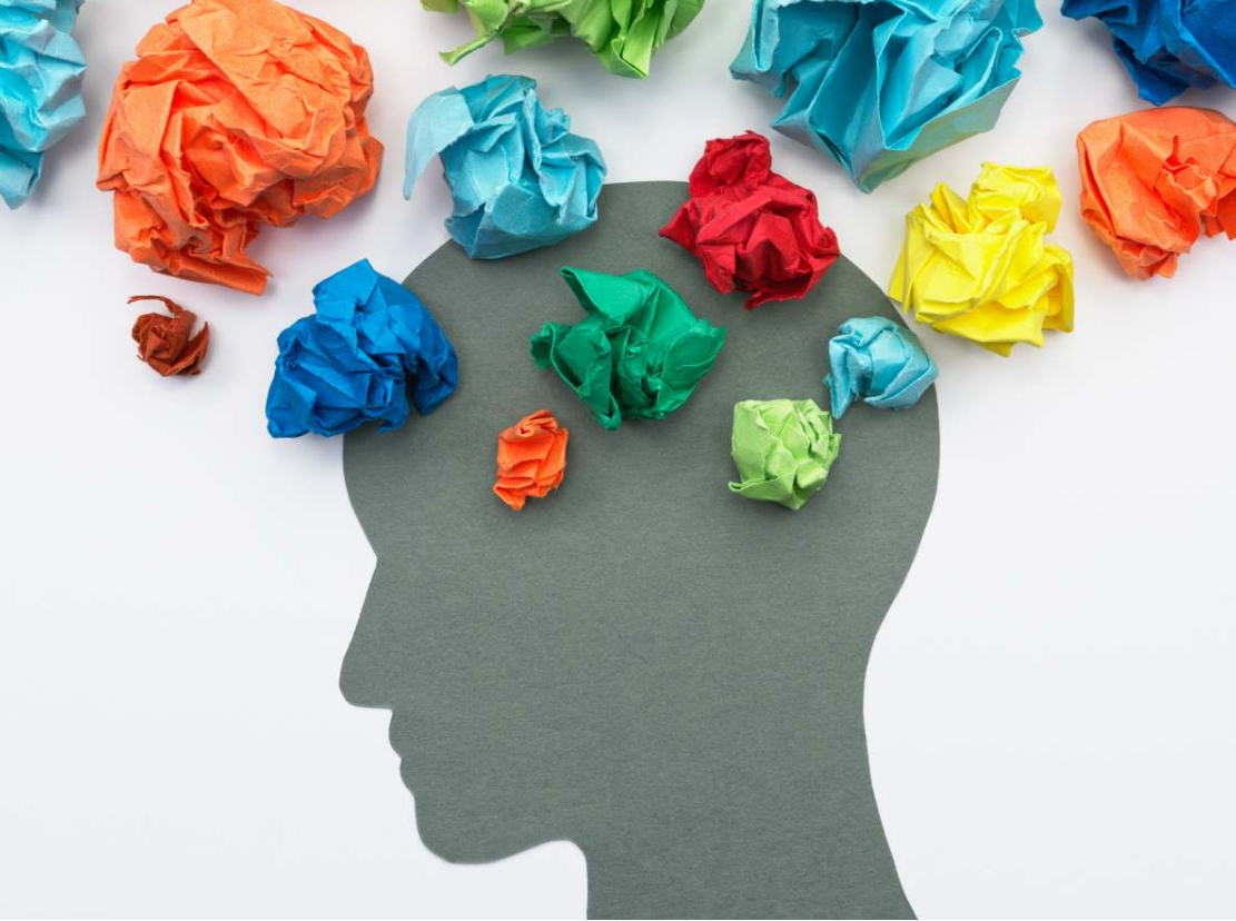
Colour palettes are often categorised as cool, neutral, warm, or vibrant. Different shades of colour can influence our perceptions and our mood, affecting how we feel in our surroundings and the decisions we make. Muted blues, greens and earth tones can inspire feelings of calmness and tranquillity, and neutral shades or warm hues such as chocolate, caramel, fawn, grey or charcoal can make us feel comfortable, cosy and at peace. Bright and bold colours like red, orange and yellow can give us energy and make us feel happy.
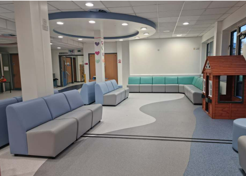
Natural and soft cool tones can help us relax, reducing stress. These shades are ideal for hospital waiting areas, quiet meeting room spaces or areas for children with special educational needs and disabilities (SEND). These calming blues, greens and earth tones mirror the natural world, helping us to connect with nature and feel at ease.
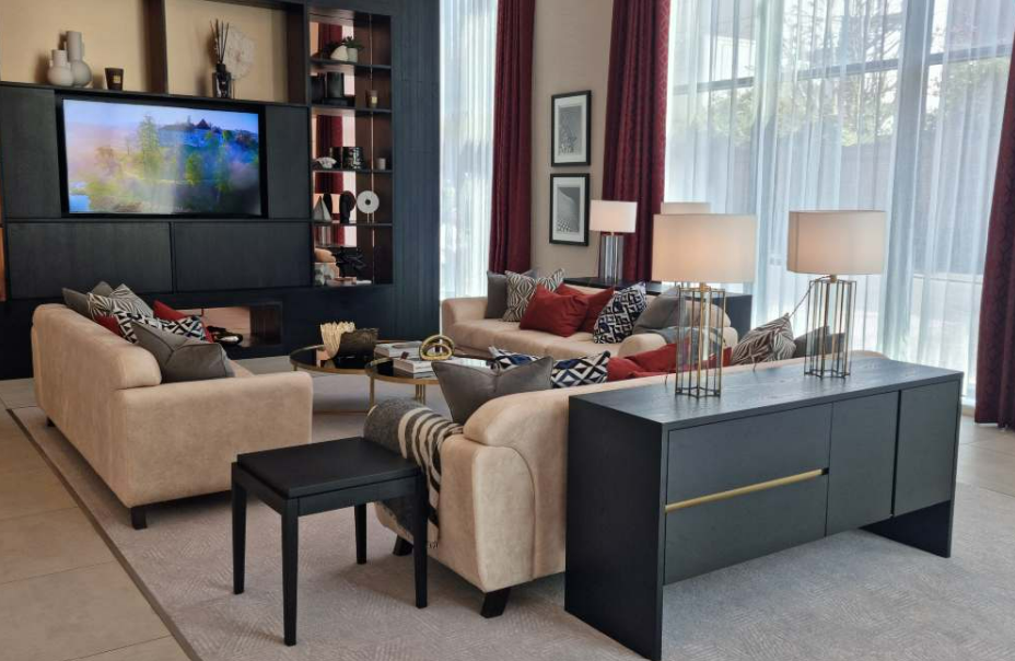
Warm shades help us to feel snug, creating a homely and comfortable environment. This is particularly important for staff breakout areas or visitor reception areas where we want people to immediately feel relaxed or welcome. Warm hues of burgundy, beige, gold, chocolate or neutrals invite people into the space.
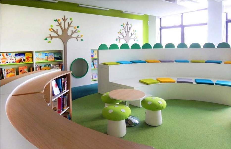
Vibrant bursts of colour inject energy and positivity. This is a great way to create inspiration in collaborative work spaces, learning environments or children’s breakout areas. Fresh, exciting and bright colours can make you feel cheerful, engaged and enthusiastic.
As interior design becomes increasingly more innovative, the importance of colour in the space and how it impacts on user experience is gaining recognition. There is an understanding of the link between colour and psychology and an increased demand to focus on striving for improved well-being.
In our rhbr showroom in Oxfordshire, we have selected neutral shades as primary colours for our soft seating, using our brand colour purple as an accent through the use of scatter cushions to create that pop of colour. The colour purple is associated with creativity, luxury and wisdom. The use of purple in our company logo represents the creative skills we have as a team of seating designers and manufacturers and the collective years of knowledge and experience we have in our industry.
If you would like help or advice selecting fabrics and colours, or space planning for seating requirements in your next project – please get in touch.